Tyler's Blog
Wednesday, 27 April 2011
Finished Ancillary Tasks - Magazine and Poster
After producing our film we could finally finish the review section on the magazine - speaking about our split screens and Guy Ritchie style snapshots. Thus we have finished the ancillary tasks for 'Face Down' to a good standard. With a consistent colour scheme in the poster and magazine.
Tuesday, 26 April 2011
How did you use media technologies in the construction and research, planning and evaluation stages?
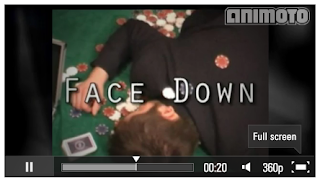
Create your own video slideshow at animoto.com.
Adobe Premier Pro - Once the pre-production and filming stages of our project were completed, Adobe Premier Pro was our primary resource in creating our film. The majority of our film was edited and exported using Premier Pro, and by experimenting with the various effects available we discovered the ‘Luma Key’. We found this helpfull to provide a darker and gloomier hue to our footage, to further enhance the gritty atmosphere we were aiming for. We also used premier pro during the evaluation stage of our production to edit the footage for both the audience feedback section and ancillary task evaluation.
Garage Band - We had a clear idea during the planning stages of the music and ambience that we wanted to create for our film. We used Garage Band to produce an original and suitable piece of music, a blend of jazz like rhythm and rock, similarly found in films such as Ocean’s eleven. We also wanted to create a more gloomy and dramatic section of music for the ending of our film, effectively helping to darken the tone and atmosphere. Whilst it was relatively easy to construct a soundtrack, we had to use the pre-detirmined tracks provided by Garage Band, as creating our own melodies from scratch proved to be quite difficult. However, by combining several different tracks we were able to compose suitable music whilst avoiding any difficulties posed by using any copyrighted music.
Facebook - We utilised Facebook to obtain a wider range of audience feedback post-production. By posting our finished film onto Facebook we were able to recieve a lot of helpful feedback, which has helped us to critically evaluate how successful our product is and the ways in which we could have improved it.
Microsoft Publisher -Microsoft Publisher was used to create both our Teaser poster and our magazine review. We firstly created the poster, utilising a black backround and a minimalist approach to our poster to connote the ambiguity of our film, inspired by the poster for the film 'Buried'. We also used Publisher to create the magazin review, which we were inspired to create by prestigious magazines such as Empire and Total film. By using Publisher we were able to easily emulate a similar style, using font stylings and text boxes to our colour specifications. We found Publisher fairly easy to use, providing a simple way to produce what we wanted. However, there were complications when trying to produce a hard copy as the text and borders tended to merge together due to the size of the printer paper. Whilst Publisher was very useful in creating our ancillary tasks online, it posed problems when trying to produce hard copies.
Adobe After-Effects - So that we could include a suitably ‘explosive’ Afghanistan scene, our group used Adobe After-Effects to add In extra sound, motion blur, bullet effects and the explosion. By getting footage of our main character running through an area that could (with some FX tweaking) be passed off as Afghanistan, the lighting was altered to create the effect of bright sunlight and heat. After-Effects was very useful in adding to the realism of our Afghanistan scene, and helped us to break the boundaries of what would we would normally be able to produce, and challenged us to break the limitations that we would otherwise have had when trying to create a believable war scene. By watching several online tutorials we were able to grasp the techniques to create the explosion.
Freesound.org - We frequently used www.freesound.org during our production stages to obtain appropriate sound effects. To create a realistic explosion for our Afghanistan scene we found a suitable explosion sound effect and the 'ringing in the ears' noise that we decided to use after the explosion for shock value. Freesound.org was extremely useful for obtaining any non-copyrighted sound for us to use in our film, specifically any musical tracks and sound effects.
Youtube - We also utilised YouTube as a quick and convenient way to upload our evaluations, finished film and pre-production tasks to our blogs. This was similarly helpful in uploading our production to Facebook, allowing us to gain useful feedback both from the social networking site and from any YouTube comments. We also found YouTube useful during the planning stages of our film to research any similar films to ours. By having access to trailers to films such as Rock n Rolla, 23 and Casino Royale we were able to gain inspiration for our own project. We would use a USB stick to take the exported film from the school computer to home where we can upload it.
Prezi - To create a more diverse presentation for our evaluation tasks, we have used several different professional slide show creators and other technologies to respond to each question.
For example, we used the presentation maker 'Prezi' to create a much more interesting and diverse appearance to our answer. Prezi also allowed us to include photos, videos both ours and from YouTube and text to go into detail regarding our finished product. Whilst Prezi was useful for creating a quick and easy to use presentation, the tools to manipulate font size proved unwieldy, making it difficult to include all the text needed on a single slide, however we were able to combat this by breaking up the text with images and videos.
Animoto - We also used 'Animoto' as a way to quickly and efficiently show the different technologies used in a short image led PowerPoint set to music. Whilst Animoto allowed us to create an interesting and fast paced slide show, the absence of any text function meant that we had to provide separate analysis of our various technologies. Furthermore, the fact that we had to use a free trial version meant that we were limited to a 30 second slot.
Panasonic NV GS230 - For the majority of our filming we used a Panasonic NV GS230 to capture our footage. It proved to be very easy to use, and efficient for our purposes, and the only criticism would be over the short battery life, which on several occasions interrupted our filming process, costing us valuable filming time. However, on the whole it was very useful, as it was portable, reliable and produced good quality footage.
What have you learned from your audience feedback?
Whilst creating our film 'Face Down' we have sought audience feedback and learnt a great deal from it. Indeed at various stages of planning on our film and ancillary tasks we asked a variety of audiences to offer their opinions, thus helping us establish our demographic and improving our product.
The audience feedback led us to the poker film idea after comments that our initial football music video idea seeking to emulate Skinner and Baddiel's 'Three Lions' music video would be difficult to produce. Taking this on board we changed to the poker film idea and received more positive comments surrounding this idea.
Using social networking sites we could accumulate honest and constructive criticism from a wide range of audiences, when posting our film we received a lot of feedback and took this on board. As well as feedback provoking changes it also reinforces something you weren't sure on. For example we were doubtful about the freeze-frames with text however after asking audiences we received really positive feedback, Dennis King saying it was 'very professional' and younger audiences enjoying the reference to Guy Ritchie films. One shot that came into question following our production was one of our characters leaving the room that was said to break the 'flow' however we felt this was necessary for the continuity, however we agreed that it could have been framed better.
We were always aware that our film could be stilted and boring and this is something that in early edits people found, however after audience feedback saying it was 'slow paced' and 'could be more exciting' we added an explosion and split screens. For this we were told it was the best part of the film, certainly it added pace and entertainment in a stylistic fashion. Another aspect of our film that was influenced by audience feedback was the very end as it was argued there wasn't sufficient 'closure'. Following this advice we added a scene in which we see Sean dead on the poker table, giving a definitive end and suiting the task.
How Effective is the Combination of Your Main Product and Ancillary Texts?
Our short film and ancillary texts compliment each other well, as they both epitomise the enigma of our product. The ambiguous teaser poster and mystery depicted in our film concerning Sean's past, reinforce each other - and whilst the film review gives some information away it avoids ruining the twist. We wanted to maintain a consistent colour scheme throughout our 3 media products with black, white and red being prominent colours - which are seen in our poster and film review but more implicitly in some shots of our film such as Eddie in a black suit behind the red backdrop.
The pictures of our central characters in the magazine film review displays there characters, with the archetypal villain Eddie staring menacingly down the camera, unsettling the viewer whilst the nervous Sean is shown in desperation looking away from the camera drinking alcohol to calm his nerves. Clearly you can see the difference the character profiles make at the centre of our review opposed to the poster in earlier designs. In addition the mock interview, influenced by 'Empire' gives the director's perspective - informing the viewer of his intention, and humanising the characters.
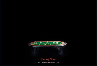
Our teaser poster utilises the creative dark space, that was used by the film 'Buried' this enhances the enigma and suggests the dark themes within our film. The poker table surrounded by a faint glow symbolises the light at the end of the tunnel for Sean but it is a treacherous path with a host of unseemly characters standing in his way of obtaining the IVF money.
The cropped picture of our poster showing the table shares many similarities with the screen-shot from the beginning of our film as the high angle shots show the cards, chips and green base. Indeed we strove to achieve a good mise-en-scene that would resemble the poker table in our poster, however the former of the two pictures above solves the riddle posed in the teaser poster. Sean's fate is shown in the last shot of our film which neatly fuses together the ancillary texts and main product to form a narrative of their own.
In what ways does your media product use, develop or challenge forms and conventions of real media products?
To present our evaluation we used Prezi, an online presentation tool that allows you to easily and slickly show videos, text and images. The Prezi above highlights all the key aspects in our research of real media products and shows how me developed and challenged their conventions.
Friday, 8 April 2011
Face Down Finished
Today we completed the production of our 'Face Down' film on Adobe Premier Pro. The film begins with the 'garageband' music we created and titles that we used a dither dissolve effect to make it look more professional. To raise the volume of the voice over we use throughout we duplicated the audio layer and synchronised it so there was no echo.
To evoke a stylish and smokey poker room, adhering to the gangster genre conventions we used a luma key effect on every shots varying the darkness depending on the lighting. Using some 'freesound.org' sounds such as low note suspense builders and reverse clangs to give empathises to flashbacks and our stop time effect. Additionally, we achieved our aim of using split screens in the final poker scene, accompanied by a punchy bass line, to show the poker flop whilst maintaining view on both the main protagonists reactions and the main poker game.
Moreover, we showed the IVF motivation through a flashback before Sean goes all in - in which we added a re verb audio effect to make the doctor's narration seem dream like and made a mock medical letter in which we use close ups of the cost £5-10,000 and the chance of success. Finally, we gave closure to our film with a still of Sean dead on the poker table at the end of the credits - catching the viewer off guard by introducing a twist at the very end, which is introduced with an ominous suspense note.
We originally ran into complication when recording the voice over for our main character Sean, as the actor who plays him was unavailable to record. However, we decided to record the whole voice over dialogue using one of our own group, so that we could edit the footage accordingly. However, after much feedback from our audiences, we decided that the voice over we had recorded was far too dull, and to correct this we subsequently used a different person for the voice over, and our feedback allowed us to create a much more interesting and versatile recording. We then synced the dialogue with our footage, and due to the lack of any dialogue from the main character in the footage, we were able to incorporate the voice over relatively easily.
The feedback we received was positive and the only major pit fall was the omission of Sean's wife, which is something we would definitely include if we had the time. Over all we are pleased with the result of the film as it matches the genre we wanted to reflect.
Subscribe to:
Comments (Atom)


